Form View
A Form view is like putting a sign-up sheet on the internet: you build it from the columns in your database, share a link, and every answer someone fills in lands as a new record — no copying and pasting on your end. It's perfect for collecting sign-ups, survey answers, leads, and applications.
When someone submits the form, their response is added as a new record in your database automatically.
Two layouts are available:
| Layout | Style | Best for |
|---|---|---|
| Classic | A single page you scroll through (like Google Forms) | Longer forms and detailed data collection |
| Step-by-step | One question per screen (like Typeform) | Engaging surveys and lead capture |
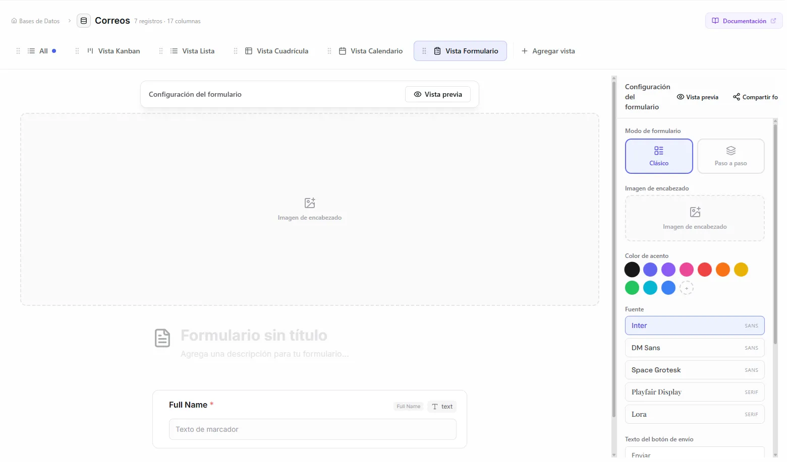 Image: Form builder interface showing the classic mode preview
Before you start
- A database with the columns you want to collect answers for. The form is built from these columns.
- At least one text column (usually "Name" or "Title"), which is always included as a required field.
Create a form
- Create a new view and choose Form
- The form builder opens automatically
- Your database columns show up as draggable form fields
- Set up each field (labels, descriptions, whether it's required)
- Click Save to keep your changes
What gets included
The builder pulls in all the regular columns from your database. A few are left out automatically because they're for the system's use, not for visitors:
- System columns (id, created_at, updated_at)
- Page content columns (
nirvai_content,nirvai_icon) - Unique-ID columns
- Self-reference columns
The first text column (usually "Name" or "Title") is always present as a required field and can't be removed.
Set up form fields
Click any field in the builder to set it up:
| Setting | What it does |
|---|---|
| Custom label | Replace the column name with a friendlier label for the form |
| Description | Helper text shown under the field's label |
| Placeholder | Hint text shown inside the input box |
| Required | Whether the field must be filled in before submitting |
Custom option labels
For Status, Select, and Checkbox fields, you can change how each option reads in the form without changing the actual value stored in your database.
Example: A Status column with the option "Company" could read as "I represent a company with 50+ employees" in the form. When someone submits, the record still stores "Company" — the friendlier label is just for the form.
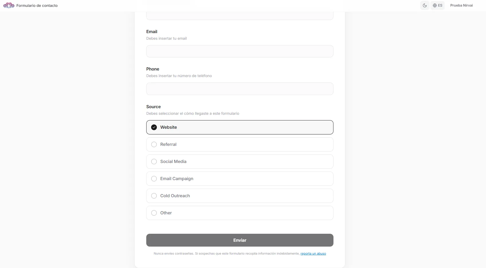 Image: Form field with custom option labels for a select column
Reorder fields
Drag fields up or down to reorder them. The order in the builder is the order people see in the published form.
Design your form
Cover image (Classic layout)
Add a cover image or color gradient to the top of your classic form:
- Click the cover area at the top of the builder preview
- Choose a gradient preset or upload your own image
- For an uploaded image, drag it up or down to reposition it
Uploaded images are saved in your organization's image library (up to 25 per organization) and can be reused across forms.
Background image (Step-by-step layout)
In the step-by-step layout, you can set a full-screen background:
- Open the background settings
- Choose a gradient or upload a 16:9 image
- Questions appear in frosted-glass cards over the background
Accent color
Set a custom color (using its hex code) for:
- The highlight on a selected option
- The submit button
- Active field indicators
Font
Pick from 5 fonts to style your form:
| Font | Style |
|---|---|
| Inter (default) | Neutral, clean |
| DM Sans | Geometric, modern |
| Space Grotesk | Distinctive, techy |
| Playfair Display | Elegant, editorial |
| Lora | Approachable, classic |
Form icon
Add an icon above the form title — the same picker you use for records (emoji, a Lucide icon, or an uploaded image).
Classic vs. step-by-step layout
Classic layout
Every field shows on a single scrolling page. It includes:
- A cover image or gradient at the top
- All fields visible at once
- A submit button at the bottom
- A check that required fields are filled before submitting
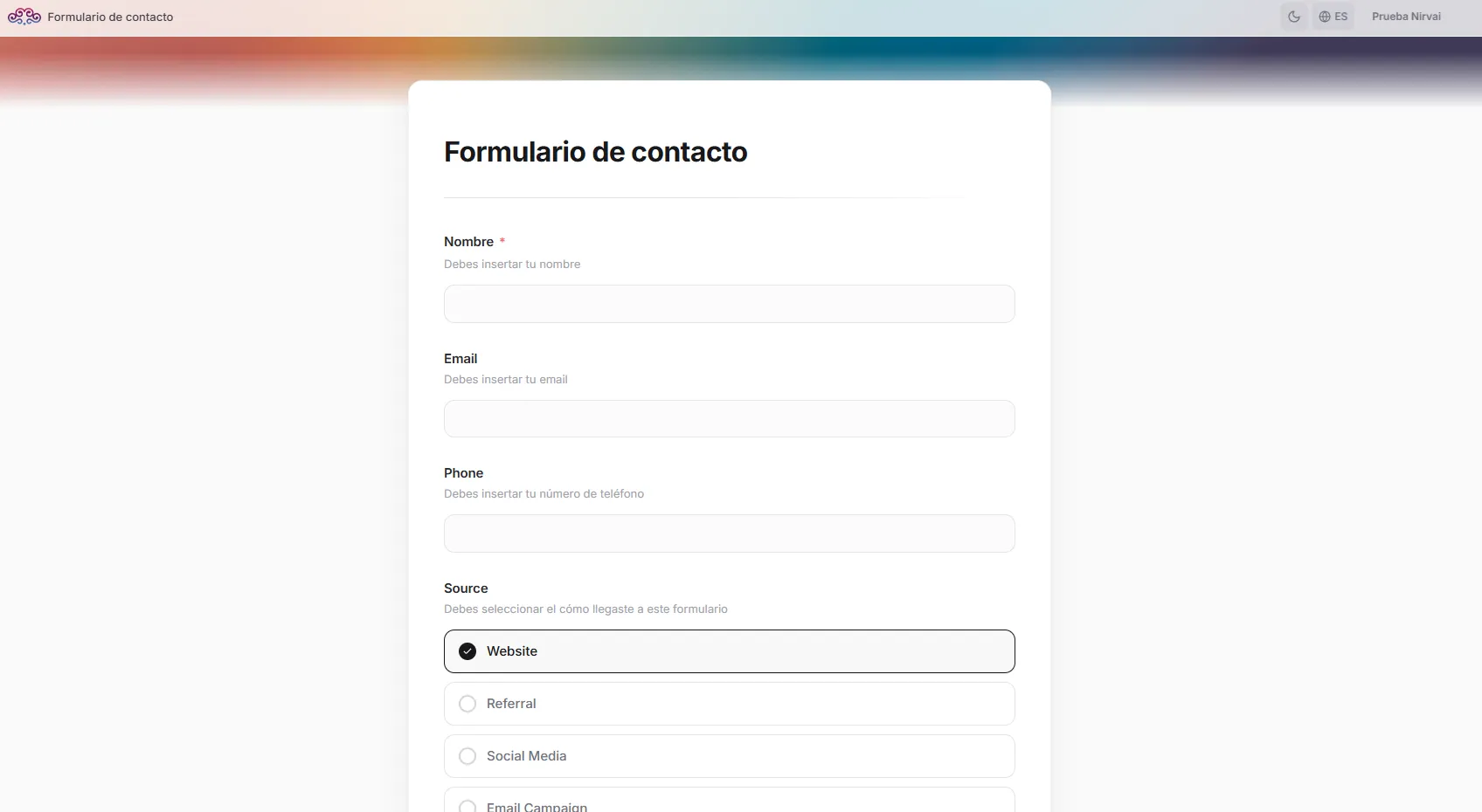 Image: Public classic form with cover image and fields
Step-by-step layout
One question per screen, with smooth transitions. It includes:
- A full background image or gradient
- Frosted-glass question cards
- A progress indicator (step counter plus a progress bar)
- Auto-advance to the next question after a choice is made for Status, Select, Checkbox, and Date fields (after a short 600ms pause)
- Enter to move on for text and number fields
- A back button to revisit earlier questions
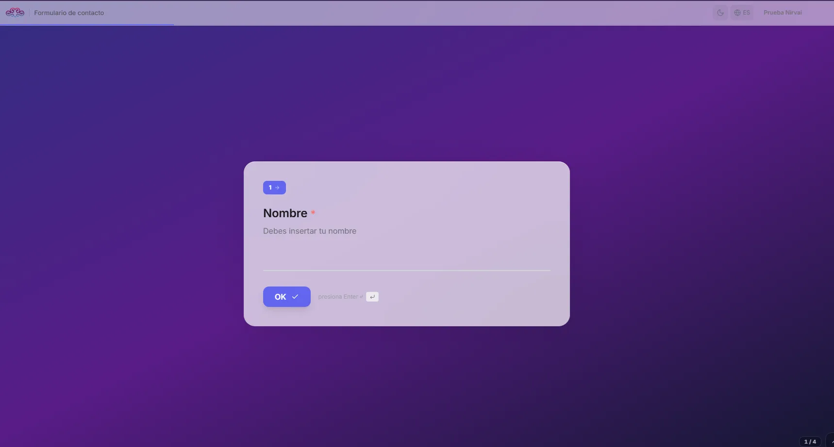 Image: Public stepper form with background and frosted glass card
Preview your form
Click Preview in the builder's action bar to open a live preview. The preview:
- Opens on a separate page
- Looks exactly as visitors will see it
- Actually submits data — responses become real records, so you can test the whole flow end to end
Use the preview to test your form with real answers before you share it. You can delete the test records afterward.
Share your form
Forms are shared with a public link. To get it:
- Right-click the form view tab
- Select Share View
- Turn on the public link
- Copy the link and share it
Public form link format: https://app.nirvana-ai.com/public/form/{token}
Anyone with the link can open the form without signing in. Visitors see your design, fill it out, and submit — and their response shows up as a new record in your database.
Thank-you screen
After someone submits, they see an animated success screen with:
- A confirmation message (you can customize it with Thank you message in the builder)
- A summary of what they submitted
- An option to submit another response (if you turn on Allow another submission)
Submit button text
Customize the submit button's label (the default is "Submit"). This is handy for forms in different languages or contexts — for example "Send", "Apply", or "Register".
Form submissions
Every submission creates a new record in your database. The record holds:
- The values the visitor entered, matched to the right database columns
- System columns (id, created_at), which are filled in automatically
You can see submitted records in any other view (List, Grid, Kanban, or Calendar) of the same database.
Forms also work with Guest Access. Guests prove who they are with email verification before filling out the form, giving you a way to collect data from people you already know.
Troubleshooting
| Problem | Fix |
|---|---|
| The submit button is always greyed out | Make sure every required field has a value. Check that the right fields are marked as required in the builder. |
Options show up as [object Object] | The status or select column's options may need re-saving. Edit the column and confirm the options. |
| The form doesn't scroll properly | The preview opens on a separate page. Make sure you're using the Preview button, not viewing the form inline. |
| A visitor can't upload a file | File uploads do work in forms. Check the maximum file size set on the file column. |
What's next
- Public Views — More ways to share your views and forms with the world.
- Guest Access — Collect responses from known collaborators who verify their email first.