Chatbot Widget
A chatbot widget is like a friendly receptionist sitting in the corner of your website — visitors see a small chat bubble, click it, and start talking to your agent without ever leaving the page. There's no redirect and no separate app to download; the conversation happens right there on your site.
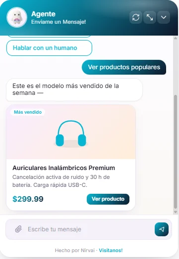
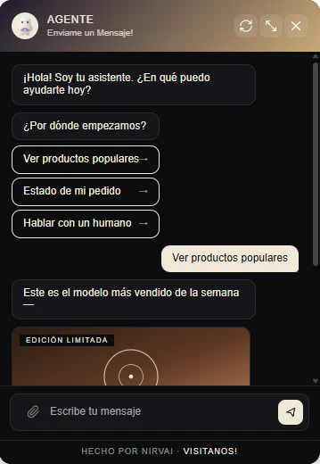
 Image: Chatbot widget embedded on a website
Before you start
- A completed agent in the Agent Control Panel
- A website where you can add a small piece of code (if you use a site builder like Wix, Squarespace, or Shopify, you'll paste it into a "custom code" or "embed" box)
- The web address (domain) of that site — for example,
mycompany.com
Setting up the chatbot widget
- Open your agent in the Agent Control Panel
- Click the Channels node
- Select Chatbot from the Web section
- Set your allowed domains — the web addresses that are permitted to display your widget (for example,
mycompany.com). This is your domain allowlist: a short list of approved sites, so no one else can drop your chatbot onto a page you don't control. - Click Create
- Copy the script tag or iframe tag that's generated for you
A script tag is a small snippet of code you paste into your site once — it loads the chat bubble for you. An iframe is a self-contained window that displays the chat inside a fixed area of your page, like embedding a video.
Embedding on your website
Add the script tag to your website's HTML, just before the closing </body> tag (the line that marks the end of your page):
<script src="https://your-chatbot-script-url.js"></script>
Or use the iframe if you prefer to place the chat inside a specific spot on your page rather than as a floating bubble:
<iframe src="https://your-chatbot-iframe-url" width="400" height="600"></iframe>
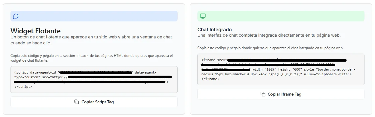 Image: Copying the chatbot embed code
Customizing the look
The chatbot configurator includes a live preview — the widget on the right of the page updates in real time as you tweak any setting on the left. Whatever you see in the preview is exactly what your visitors will see on your website.
Choosing a theme
The widget ships with three visual themes. Each one applies a coordinated set of colors, corner shapes, and overall styling — pick the one that best fits your brand.
| Theme | Style | Best for |
|---|---|---|
| Minimalist (default) | Solid color header, sharper corners, clean typography | Professional sites, software dashboards, business-to-business |
| Vibrant | Soft two-color gradient banner, rounded message bubbles | Consumer products, lifestyle brands, playful tone |
| Elegant | Dark editorial surface with a cream accent, optional gradient banner | Premium brands, editorial sites, sophisticated look |
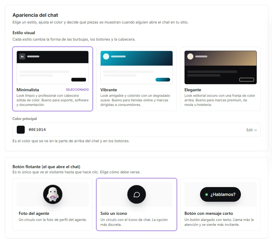 Image: Theme picker and launcher button selector in the chatbot configurator
Clicking a theme tile instantly applies it — along with its recommended default colors — to the live preview. You can switch themes at any time without losing your other settings.
Here's how each theme renders in the live widget:
| Minimalist | Vibrant | Elegant |
|---|---|---|
 |  |  |
Customizing colors
Every theme starts with sensible defaults, but you can override them:
- Accent color — Drives the header banner and the send button. This is the main brand color of the widget.
- Secondary color — Adds the second color for the gradient in the Vibrant and Elegant themes (the Minimalist theme uses a solid color and ignores this field).
Both fields use a color picker that accepts HEX, RGB, and HSL color values. Pick from a palette or paste your exact brand color.
Header
Personalize how your agent introduces itself:
| Field | Description |
|---|---|
| Assistant name | Bold name shown at the top of the widget |
| Assistant subtitle | Smaller line under the name (e.g., "AI assistant — typically replies in seconds") |
| Header style | Solid (single accent color) or Gradient (blends accent into secondary). The Vibrant and Elegant themes default to gradient. |
Launcher button
The launcher button is the floating button visitors click to open the chat. It has three style options:
| Launcher type | What's shown |
|---|---|
| Image | Your agent's profile photo (rounded). Recommended when the agent represents a person or brand mascot. |
| Icon | A clean chat-bubble icon in your accent color. The classic minimal look. |
| Text | A text pill button with custom wording (set via the Launcher label field — e.g., "Chat with us", "Need help?"). |
You can see all three launcher styles previewed in the appearance configurator screenshot above.
Footer
Optional small text below the chat input. Useful for compliance links or a gentle promotion:
- Footer enabled — Turn the entire footer on or off
- Footer text — Plain text shown before the link (e.g., "Powered by")
- Footer link — The web address the link points to
- Footer link label — The visible text for the link (e.g., "Your Company")
Widget controls
Show or hide controls inside the widget:
| Toggle | What it controls |
|---|---|
| Show clear chat | The "clear conversation" button in the header |
| Show fullscreen | The expand-to-fullscreen button in the header |
| Allow file upload | The paperclip attach button in the input row, which lets visitors send files |
| Input placeholder | The greyed-out hint text inside the message box (e.g., "Ask me anything...") |
Intro quick-reply buttons
Add a few suggested questions visitors can tap right when the chat opens — perfect for steering the conversation toward your most common requests:
- "What can you help me with?"
- "Show me your pricing"
- "Talk to a human"
These appear as themed buttons under the welcome message and disappear once the visitor sends their first reply. When set, they take priority over the standalone first message — so you can use them to replace the default welcome with a more interactive opener.
Configure your chatbot from the dedicated Chatbot page (under your agent's exports) for the largest preview and the most room to iterate. The same configurator also opens in a side panel inside the agent flow, so you can tweak the look without leaving the agent editor.
Special response types
Beyond regular text replies, the chatbot can show rich, interactive responses when it makes sense. You turn on each response type from the How the chatbot responds section of the configurator — each one comes with a live preview so you can see the result before turning it on.
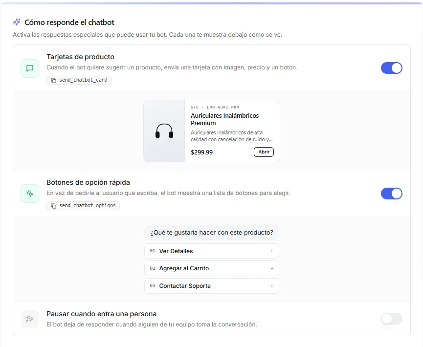 Image: Special response toggles: product cards, quick option buttons, and pause when a human joins
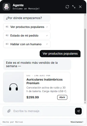
Product cards
When the agent wants to suggest a specific product or item, it can send a rich card instead of plain text. Each card includes an image, title, product code (SKU), short description, price, and an action button.
Turn on Product Cards in the configurator to let your agent send these cards. Common uses:
- Online stores recommending products
- Real estate bots showcasing listings
- Course catalogs and bookings
- Any time an image + price + button tells the story better than words
The card style automatically adapts to the active theme — sharper corners in Minimalist, soft rounded shapes with badges in Vibrant, dark editorial layout in Elegant.
Quick option buttons
Instead of asking the visitor to type, the agent can show a list of clickable buttons. The visitor taps an option and the conversation moves forward — no typing required.
Turn on Quick Option Buttons for uses like:
- "How can we help?" → "Track an order" · "Talk to support" · "Browse products"
- Guided onboarding flows
- Survey-style conversations
- Any branching menu
This greatly reduces friction on phones and improves response rates compared to open-ended prompts. Like product cards, the button style adapts to the active theme.
Pause when a human joins
When someone from your team takes over a conversation from the Chat View, you usually want the bot to stop responding so it doesn't talk over the person. Turn on Pause when a human joins to make this automatic — as soon as a teammate sends a message in a conversation, the agent goes silent for that conversation until you switch it back on.
This is the recommended setting for support that mixes the bot with real people. Leave it off only if you specifically want the bot to keep replying even while a human is in the conversation.
What your agent can do
| Capability | Supported |
|---|---|
| Respond to messages | ✓ |
| Send text messages | ✓ |
| Send images | ✓ |
| Send files | ✓ |
| Send audio | ✓ |
Chat View and human takeover
Like the Meta platform channels, the chatbot widget includes a Chat View in the Agent Control Panel where you can watch conversations and take over from the agent.
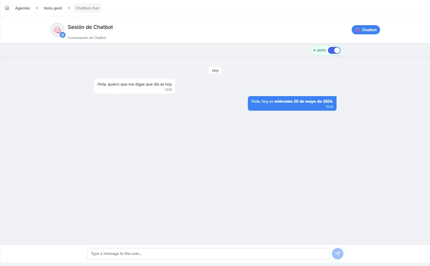 Image: Chatbot Chat View with agent toggle
Toggling agent response
Each conversation has its own toggle:
| Mode | What happens |
|---|---|
| Auto (enabled) | The agent responds automatically to visitor messages |
| Manual (disabled) | The agent pauses — you respond yourself as a human |
When in Manual mode:
- The agent stops replying to that specific visitor's conversation
- You can type and send messages directly
- Switch back to Auto when you're ready for the agent to resume
This is useful for live support where a person needs to handle a tricky question while the agent handles everything else.
Domain settings
The widget only loads on web addresses you've approved — your domain allowlist. This stops unauthorized websites from putting your chatbot on their own pages.
- Add multiple domains if your site runs on different addresses (e.g.,
mycompany.com,www.mycompany.com,app.mycompany.com) - For testing, you can add
localhost(the name your computer uses for a site running on your own machine) while you develop
Managing your export
- Edit: Update allowed domains or regenerate the embed code
- Remove: Deactivate the widget. It will stop loading on all websites immediately.
Troubleshooting
| Problem | Fix |
|---|---|
| Widget doesn't appear | Check that the script tag is placed just before </body>, and that your domain is in the allowed list |
| A message about "CORS" or "blocked origin" appears | The site address isn't on your allowlist. Add your exact domain — including the https:// part — to the allowed domains |
| Widget appears but the agent doesn't respond | Check that the conversation's toggle is set to Auto in the Chat View |
| Widget loads slowly | The script loads in the background and shouldn't slow your page down. Check your internet connection |
| It works on your test site but not on the live site | The live address is probably missing from the allowlist. Add every address your site uses (with and without www.) |
What's next
To compare the widget with the other ways to put your agent on the web — a public link or a developer connection — see the Channels Overview. For a code-driven connection, continue to API Access.